If you’re involved in running your university website, it’s easy to check how “bouncy” it is. Google Analytics will tell you how many visitors leave right away and show you which pages seem to have a built-in “exit” sign.
Diagnosing the problem is the simple part. The challenge is figuring out how to transform those bouncy pages into sticky ones. How do you decide what to change, to ensure prospective students engage with you for longer?
Earlier this year I ran a series of focus groups with students in Italy, France, and the UK. They pretty much all had some strong words to share on the subject of university websites. Based on their feedback, here are 7 reasons prospective students may be leaving yours…
1. Confusing navigation
Students want and expect site navigation to be intuitive – but often find the opposite. In the words of Tamara, a Swiss student in Italy, many university websites are “created in strange patterns”. Have you tested your user journeys lately? If not, this could be your problem.
Confusing site navigation won’t just drive students away; it could also leave them with a negative impression of your university. Italian master’s student Pietro summarises: “If you as a university cannot organize your website well, how can you teach me?”
2. Too many clicks
Even if your user journey makes sense, you still need to ensure there are a few clicks as possible between the user and his/her objective. Here, the students I spoke to were again very clear: too many clicks and they’ll leave.
3. Missing information
Another common problem cited by prospective students is missing information. Hard as they search, it seems the information they want is just not available on the university site. This often includes quite basic information, with many students reporting not being able to view the curriculum of courses they were interested in.
Failing to provide enough information could mean you’re sending potential applicants elsewhere. As master’s applicant Valerio says: “If when I go to the website I don’t see the syllabus and the list of teachers… I am not able to choose properly.” As a result, he would be likely to choose another option.
4. Bad information
Before you start to believe the key to success is simply providing as much information as possible… think again! Students may be leaving your site (and crossing you off their shortlist) because you’ve published information that could be interpreted negatively.
Prospective UK undergraduate Jack gives the example of statistics on graduates’ next steps. In one case, he’d encountered stats showing that no graduates stayed on for further study at the same university, though many pursued master’s degrees elsewhere. This left him wondering why no one chose to stay.
This doesn’t have to mean publishing less information; a few sentences to add context could be all that’s needed.
5. Blowing your own trumpet
It’s also possible to go over the top with information that seems undeniably positive. Your university’s high ranking position, for example. Awards you’ve won, praise from graduates, number of Nobel laureates in your community, and so on.
There’s a fine line to walk here. Some students say they’re actually deterred by university websites that seem to list a never-ending stream of accolades. So if your bounciest page is also your shoutiest page, consider toning it down.
6. You sound the same as every other blah blah blah…
Andreas, a prospective PhD candidate in Paris, says he always visits the “About Us” section of university websites… and it’s “always the same”. Likewise, fellow Parisian Salimatou complains that she’s sick of seeing the same few companies mentioned in information about career outcomes.
Does your university website really reflect what makes your institution different? Would you be able to pick your own “About Us” section out of a pile? If not, students may simply be leaving your site because they’re bored of reading the same old marketing spiel on repeat.
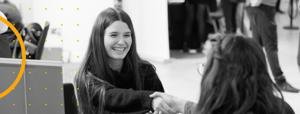
7. They don’t like your pictures
Today’s students are savvy, ambitious and well-informed. They will see through your marketing speak in a shot.
But that doesn’t mean they don’t want to see stunning pictures of your university campus. They do.
Make sure your university website shows off your campus and facilities in their best light. Yes, prospective students will realize this is a photoshoot. They know this isn’t a magical land where the sun always shines and the students always smile. But a good image still goes a long way.
And three bonus reasons…
8. Your site isn’t mobile-optimised
9. It’s not translated into their language
10. They’re going to check you out elsewhere
The first two of these should be easy to diagnose using Google Analytics to identify trends based on users’ device type and language. The third is trickier, and really a best-case scenario. If students’ interest is engaged, they are likely to search elsewhere online for supplementary information – but they’re unlikely to do that after visiting just one page of your site!
Want more tailored advice? Contact us to find out how we could help.